
哈尔滨威尔焊接有限责任公司

Company Profile
Corporate Image
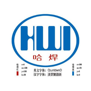
Definition of Enterprise Logo
Ellipse: It embodies the international and diversified development concept of Harbin Institute of Welding, and demonstrates the broad inclusiveness of the enterprise. At the same time, it implies that the welding industry is as stable as a rock.
H: Representative - Harbin. Symbolizing the technological strength and regional culture of this city.
W: Representative - Welding. Shaped like flying wings, transformed into mountains, symbolizing the brave ascent of science by Ha Hao.
I: Representative - Research Institute. The design is simple, as if it embodies the upward "1", symbolizing the strategic development goal of Harbin Institute of Welding - to build an international first-class scientific research institution.
The identification colors are determined to be blue and red
Blue: Refers to the vigorous vitality of Harbin Welding and its profound expertise in the field of welding technology.
Red: Refers to the vigorous vitality of welders and their infinite enthusiasm for the welding industry.
健康、和谐、责任、创新
历史沿革、薪火相传、开拓创新、稳步进取
Enterprise
About Us
Harbin Ware Welding Co., Ltd. is one of the pillar industry companies affiliated to Harbin Welding Research Institute. It is a global open national high-tech enterprise integrating scientific research and development, production, sales and service.


